



















Technology
The Restaurant Website Blueprint: What to Include and Where
Sep 16, 2026
TLDR
A restaurant website can lose an order before a guest even reaches the menu. Hide the food, location, hours, or order button behind too much content and people have little reason to keep searching. A better restaurant website gives every important task a clear place, from discovering the menu to finding a location and ordering directly. The goal is simple: help customers get what they came for quickly while giving Google clear, useful information about your restaurant. This guide breaks down what to include, where it should go, and how each part should connect.
Start With a Restaurant Website Structure Customers Can Use
Before choosing colors, fonts, or homepage photos, decide what information needs its own place.
A single long homepage may look clean, but it can quickly become difficult to use when it tries to hold the full menu, every location, catering details, rewards, gift cards, restaurant history, and ordering information at once.
Decide What Needs Its Own Page
Start with the pages that match real customer needs. A restaurant site will usually need a homepage, menu, and location area. From there, add dedicated pages for services that need room to explain or sell something, such as catering, private events, gift cards, rewards, or franchise opportunities.
The menu can go deeper too. A useful structure may move from the main menu into categories such as burgers, breakfast, coffee, or desserts, then into individual dishes. That creates a clear path for someone looking for a specific item instead of forcing them to scan one very long list.
Keep Supporting Content on the Homepage
Not every part of the business needs another page. Featured dishes, reviews, a short brand story, location previews, app promotion, rewards, gift cards, and common questions can often work well as homepage sections.
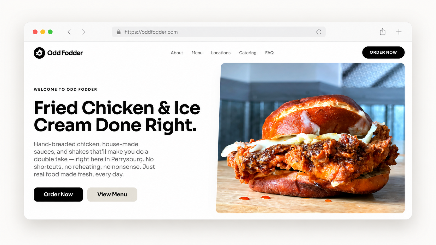
Odd Fodder is a good example of this structure in practice. Its homepage introduces the restaurant, promotes selected food, explains the brand, shows catering, provides location details, promotes its app, and answers common questions. The site then gives the menu its own page rather than squeezing the full offering into the homepage.
This approach also fits Google's current guidance. Google recommends creating clear, useful content for people and making important pages easy to discover through crawlable links.
The key is to create a separate page when the visitor has a separate reason for being there. Someone planning an office lunch needs different information from someone ordering dinner tonight.
Build the Restaurant Homepage Around What Customers Need First
The homepage should make the restaurant understandable within a few seconds.
Make the First Screen Clear
The top of the page should answer four simple questions:
- What do you serve?
- Where are you?
- What makes your restaurant worth considering?
- What can the customer do next?
This is why a heading such as “Welcome to Our Table” wastes valuable space. It may sound warm, but it tells a new visitor almost nothing. A line such as “Wood-Fired Pizza in Austin” immediately gives the page meaning.
Mill Top Bakery takes a simple approach. Its opening section leads with “Artisan Breads & Pastries,” follows with a message about fresh daily baking, and gives visitors immediate options to order online or view the menu. The customer understands the product and the next step without having to scroll through an introduction first.
Show the Food Early
Once the first screen has established what the restaurant offers, give customers something they can actually consider ordering.
Feature signature dishes, popular choices, seasonal items, new releases, or products the restaurant is known for. Include good images, useful names, and prices where appropriate.
Do not make a new customer read several paragraphs about the business before seeing the food. The story can add personality later. At the start of the visit, appetite and clarity matter more.
Put Homepage Sections in a Useful Order
A practical homepage flow could look like this:
- Navigation
- Main message with Menu and Order actions
- Signature or featured food
- Customer reviews
- What makes the restaurant different
- Catering or another important service
- Locations
- App, rewards, or gift cards
- Common questions
- Footer
This order is not fixed. A restaurant with ten locations may bring locations higher. A business known for office catering may feature catering earlier. Placement should follow what customers are most likely to need, not a rigid template.
Make the Restaurant Menu Easy to Browse, Search, and Order From
For a restaurant, the menu contains some of the most useful content on the entire site. It tells people what you sell, how much it costs, what goes into each dish, and what makes your food different.
That information should live on the website as readable content.
A menu locked inside a PDF or image creates extra work for customers, especially on a phone. It also gives search engines less useful page content to understand. Square similarly recommends placing menus as written website content instead of relying only on an image or PDF so search engines can crawl the information.
Give the Menu a Clear Home
The main menu page should help someone understand the food before asking them to begin an order.
Maa Kitchen does this well. Its menu has a dedicated page where customers can browse food categories, see popular dishes, open the full menu, find locations, or move directly into ordering for pickup or delivery.
This gives someone several useful entry points instead of dropping every visitor into the same long ordering screen.
Organize Food the Way Customers Think About It
Categories should use familiar names that describe what is actually inside them.
Maa Kitchen, another restaurant that uses the Per Diem website, separates parts of its menu into categories such as Chicken & Lamb Sizzlers and Non Veg Appetizers. Its Chicken & Lamb Sizzlers category then has its own page with available dishes, prices, ordering access, and a route back to all categories.
A coffee shop could use Coffee, Matcha, Breakfast, Pastries, and Cold Drinks. A pizza restaurant might use Pizza, Wings, Salads, Desserts, and Family Meals.
Clear category names also give search engines stronger context. Google's search guidance recommends using the words people naturally use when looking for a page rather than trying to cover every possible keyword variation.
Give Important Dishes Their Own Pages
Important dishes can go one level deeper with their own page. A useful food page can show the item name, description, price, photo, category, dietary details, and a direct ordering action.
This gives customers a focused view of a dish and creates a stronger page for searches around specific food items.
It also creates a logical structure:
Menu → Category → Dish → Order
The customer can move from browsing to choosing without losing their place.
Write Descriptions That Help People Choose
Descriptions matter here. “Chicken Sandwich” gives a customer very little to picture. “Crispy hand-breaded chicken with bourbon bacon, Swiss cheese, and house sauce on a toasted pretzel bun” helps someone understand exactly what they are considering.
Include details that genuinely affect the choice, such as key ingredients, cooking style, sauces, spice level, portion type, or dietary information.
Write descriptions to sell the food first. Search relevance follows naturally when the page clearly describes the actual dish.
Keep Menu, Ordering, and Other Key Actions Close
Your website should not make someone work to find the next step.
There is no Google rule saying every page must sit within three clicks. What matters is creating a logical structure where useful pages are linked clearly and can be found without digging through several screens. Google specifically recommends linking important pages from other pages on the site and using link text that tells people what they will find after clicking.
Keep Important Pages Within Easy Reach
For a restaurant, a simple standard works well:
Menu should be one click from the homepage.
Ordering should be immediately available.
Locations should be one click away.
Catering should be easy to reach when it is an important part of the business.
Menu categories should usually take no longer than two clicks to reach.
Individual dishes should normally sit within two or three steps.
The goal is not to chase an arbitrary click count. It is to remove unnecessary steps between interest and action.
Keep the Main Navigation Focused
The main navigation should stay simple. Menu, Locations, Catering where relevant, and a clear Order Now action are usually far more useful than a navigation bar filled with every feature the restaurant offers.
Rewards or Gift Cards can appear when they are an important part of the customer experience, but adding every possible destination can make the site harder to scan.
Place Order Actions Where Intent Is Highest
Ordering should appear in places where a customer is already close to making a decision.
Someone looking at a featured dish, a full menu, or a location page should not need to return to the homepage to place an order.
Clear actions such as Order Now, Order Pickup, or Order Delivery tell the visitor exactly what happens next.
Connect Related Pages Naturally
Internal links should follow the way people move through the site.
A menu can lead into categories.
Categories can lead into individual dishes.
Location pages can lead into ordering.
Catering pages can point to the locations that provide the service.
These connections also help search engines understand how the pages relate to one another.
The point is not to keep the website small. It is to make every path obvious.
Give Every Restaurant Location a Useful Local Page
For a restaurant with several locations, one general Locations page is not enough. Each store should have its own page with information specific to that restaurant.
Maa Kitchen has separate locations in Jacksonville and Saint Johns. Customers can choose a location and move into pickup or delivery instead of sorting through information for both stores at once.
Include the Details People Search For
A useful location page should clearly show the restaurant name, city or neighborhood, address, opening hours, phone number, directions, menu access, pickup, delivery, and ordering options.
Local details can make the page even stronger. Parking information, outdoor seating, nearby landmarks, delivery coverage, or other useful facts can help a customer decide if that location works for them.
Each store should also have its own clear page title and description instead of repeating identical information across every branch.
Google says local results are mainly shaped by relevance, distance, and prominence. Accurate business details, helpful location content, reviews, and a complete Google Business Profile can strengthen the signals a restaurant can control.
Give High Value Restaurant Services Their Own Space
Some offers deserve room beyond a small homepage banner because the customer needs different information before buying.
Build Catering Pages Around the Order
A catering page should answer practical questions such as what packages are available, how many people they serve, how much notice is required, which locations provide catering, and how pickup or delivery works.
The same principle applies to private events. Show capacity, available spaces, food options, photos, and a clear inquiry route.
Gift cards and rewards need enough information for customers to understand how they work, but they do not always need large standalone pages. Give them extra space when they are a meaningful part of the business.
Franchise information should stay separate from the normal ordering journey. Someone interested in opening a franchise has a completely different goal from someone looking for lunch.
Build Trust With Reviews, Real Photos, and Useful Answers
Once customers know what you sell, give them reasons to feel confident choosing you.
Use Proof Instead of Big Claims
Customer feedback is stronger than writing “best restaurant in town” about your own business. Place a small number of useful reviews where someone may still be deciding.
Mill Top Bakery includes a customer review alongside its bakery story, location details, and common questions. The page gives visitors information from both the business and an actual customer.
Real food and restaurant photography adds another layer of confidence. Show what customers can genuinely expect. Use clear images of signature items, the dining space, storefront, or bakery counter instead of relying on generic stock photos.
Add FAQs for Customers and AI Search
FAQs can also help with AI search because people increasingly ask full questions such as “Does this restaurant offer gluten free options?” or “Where can I order catering nearby?” Clear, direct answers about dietary choices, parking, reservations, catering, delivery, hours, or other common concerns give customers quick information and make it easier for search and AI systems to understand and potentially surface your restaurant in relevant answers.
Here’s your guide to getting 5-star reviews on Google.
Optimize Every Page for Search and Mobile
Search optimization should support the customer experience, not make the writing sound unnatural.
Each important page needs a clear title, a useful main heading, a short description of its purpose, relevant images, natural internal links, and an obvious next action. Use the language customers use to describe the food and service without repeating the same phrases across every page.
Make Mobile Use Easy
Restaurant searches often happen when someone wants an answer quickly. Menus should be readable without zooming. Buttons should be easy to tap. Directions, hours, and ordering should not disappear behind complicated navigation.
Large image files and unnecessary effects can also slow down the experience. Resize and compress photos while keeping the food looking sharp.
Behind the visible page, a good restaurant website should also give search engines a clean structure to follow. Clear URLs, a sitemap, breadcrumbs, and restaurant structured data can help communicate details such as the business name, address, hours, menu, cuisine, and location.
*Access our free E-book on a complete guide to menu management and optimization. *
Turn Website Visitors Into Repeat Customers
The website can keep working after the first order.
App downloads, rewards, gift cards, email, and other customer programs make the most sense after a visitor has already seen value in the restaurant.
Mill Top Bakery handles this naturally by introducing its app further down the page. By that point, a visitor has already seen what the bakery offers and where it is located. The app then gives customers a reason to come back, with ordering, scheduled pickup, and rewards.
Use the same logic for loyalty. Explain the benefit clearly instead of interrupting a first-time visitor with a signup request before they have even viewed the menu.
A strong restaurant website can move someone from discovery to an order, then create a direct connection that makes the next visit easier.
*Ready to build a better restaurant website? Book a demo with Per Diem and see how it all works together. *
Final Thoughts
A good restaurant website does not need endless pages or complicated design. It needs the right information in the right place.
Make the restaurant clear from the first screen. Give the menu room to be explored. Keep ordering close. Build useful pages for each location and major service. Add real proof, strong visuals, and simple answers. Then make the whole experience fast and easy to use on a phone.
With Per Diem Website Builder, restaurants can bring their menu, locations, ordering, catering, app, rewards, gift cards, reviews, and other customer experiences into one connected website.
The result is a site built around how people actually discover, choose, order from, and return to a restaurant.