.svg)


TLDR
Good design is invisible until it fails. A recent study revealed that strong UX can lift conversion rates by 400%, proving how much small details matter. Think of a door that looks like it should pull but only pushes; that single flaw frustrates the user. The same principle applies to everything, including mobile ordering apps. Don Norman’s The Design of Everyday Things explains why design either guides or confuses, and those lessons are more relevant than ever for restaurants and cafés relying on apps as their main storefront.
Why Don Norman’s Principles Still Matter in the Online World
When Norman introduced concepts like affordances, signifiers, and feedback, he was describing how people naturally interpret the world around them. A teapot handle affords gripping. A green light signifies go. Pressing a button should trigger feedback so you know it worked.
In apps, these same elements are critical. Here is how they map over:
- Affordances: A button should look clickable. An image carousel should hint that it can be swiped.
- Signifiers: Labels or icons must guide action clearly, so users don’t guess what a symbol means.
- Feedback: Every tap should trigger a visual or sound response, reassuring users that their input was received.
- Constraints: By limiting possible errors, the design prevents frustration. For example, disabling unavailable times for food pickup.
- Mappings: Controls should behave in ways people already expect. A left swipe should reveal, not delete, unless users confirm.
- Conceptual models: The structure of the app should mirror how customers think. If they expect checkout to follow a sequence of menu → customization → cart → payment, the design should match that mental path.
These principles may sound basic, yet overlooking even one of them can derail an experience. For developers, keeping Norman’s framework front and center ensures that an app feels like second nature to its users.
Why These Rules Matter in Mobile Ordering
For many cafés and restaurants, the first customer touchpoint lives on a phone screen. Clear cues and quick paths turn intent into orders. Confusing layouts do the opposite.
Cart abandonment stays high across digital commerce, and long or complex flows are a major cause. Keep steps short, fields few, and progress obvious to reduce drop-off. Baymard’s tracking places global cart abandonment near 70%, which shows how sensitive checkout is to friction.
When flows feel smooth, customers return, reorder, and recommend. Design choices that reduce effort create a habit loop: open, order, enjoy, repeat. That loop powers lifetime value as much as any promotion.
When Food Ordering Apps Get Design Wrong
Unfortunately, some well-known brands still stumble with design, illustrating exactly what happens when Norman’s principles are ignored.
Empanada City
The Empanada City app hides its core offering behind unnecessary steps. Customers have to click through multiple menus before finding basic items, which slows the process from the very beginning. The checkout flow compounds the problem: pages load slowly, and orders sometimes appear frozen in progress. Without feedback, users are left uncertain if their payment went through. This breaks trust and leads to frustration, especially when hungry customers just want reassurance that food is on the way.
The Corner Bakery
The Corner Bakery app overwhelms users with crowded layouts and excessive options on each screen. Instead of guiding customers through a clear sequence, it forces them to process too much information at once. Adding items to the cart is inconsistent—sometimes requiring multiple taps, and there is often no clear signal that the action succeeded. This lack of signifiers and complex mapping forces customers to double-check everything, creating extra steps in a process that should feel effortless.
In both cases, the issue is not missing features. Menus, carts, and checkout options exist. The failure lies in how those elements are presented and connected. When design forces customers to think too hard, the app becomes a barrier rather than a gateway. In competitive markets, that is enough to send users straight to a better-designed alternative.
Examples of Well-Designed Apps
Some apps prove that ordering can be simple and enjoyable when design principles are applied with care. Let’s take a look at them.
Sweetgreen
Sweetgreen’s app is a model of clarity. The design is minimal yet purposeful. Buttons are unambiguous, the checkout button is always visible, and past orders can be repeated with a single tap. Feedback is immediate: when you add an item, it slides into the cart in a smooth animation. Payment is fast, with confirmation screens that leave no doubt about the order status. The flow feels so natural that customers can order during a quick break without stress. By respecting feedback, mapping, and conceptual models, the famous health-food chain has turned ordering into a frictionless experience.
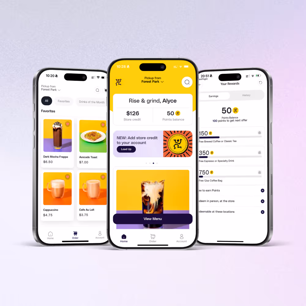
Starbucks
Starbucks has built one of the most successful mobile ordering ecosystems in the food industry, and it's not hidden from anyone. Its loyalty program is deeply integrated, with stars that fill progress bars and rewards clearly displayed. These signifiers keep customers motivated and engaged. The ordering flow is predictable and fast, while push notifications provide feedback on order status. Starbucks reports that in the U.S., mobile orders, drive-thru, and delivery together now account for about 74% of its total sales, with the app playing a central role. This shows how clear signifiers and consistent feedback can drive not only engagement but also revenue.
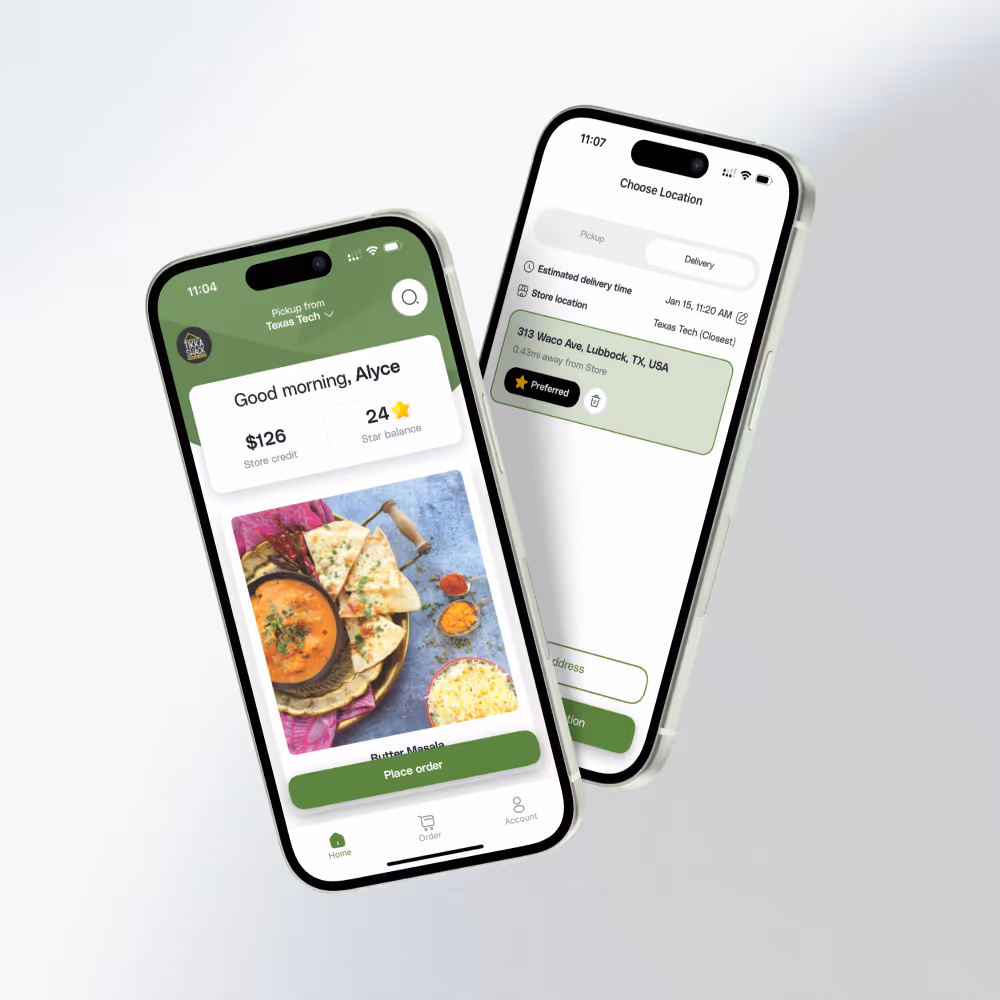
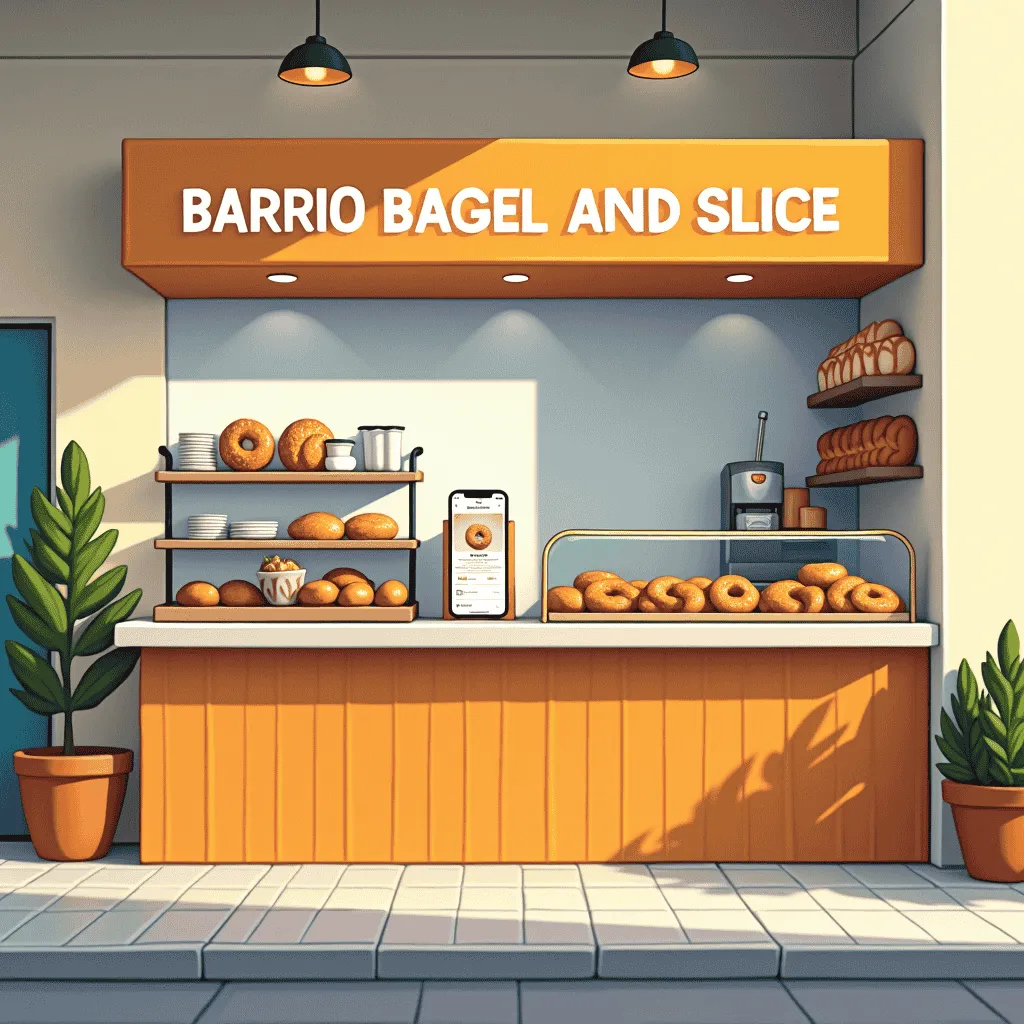
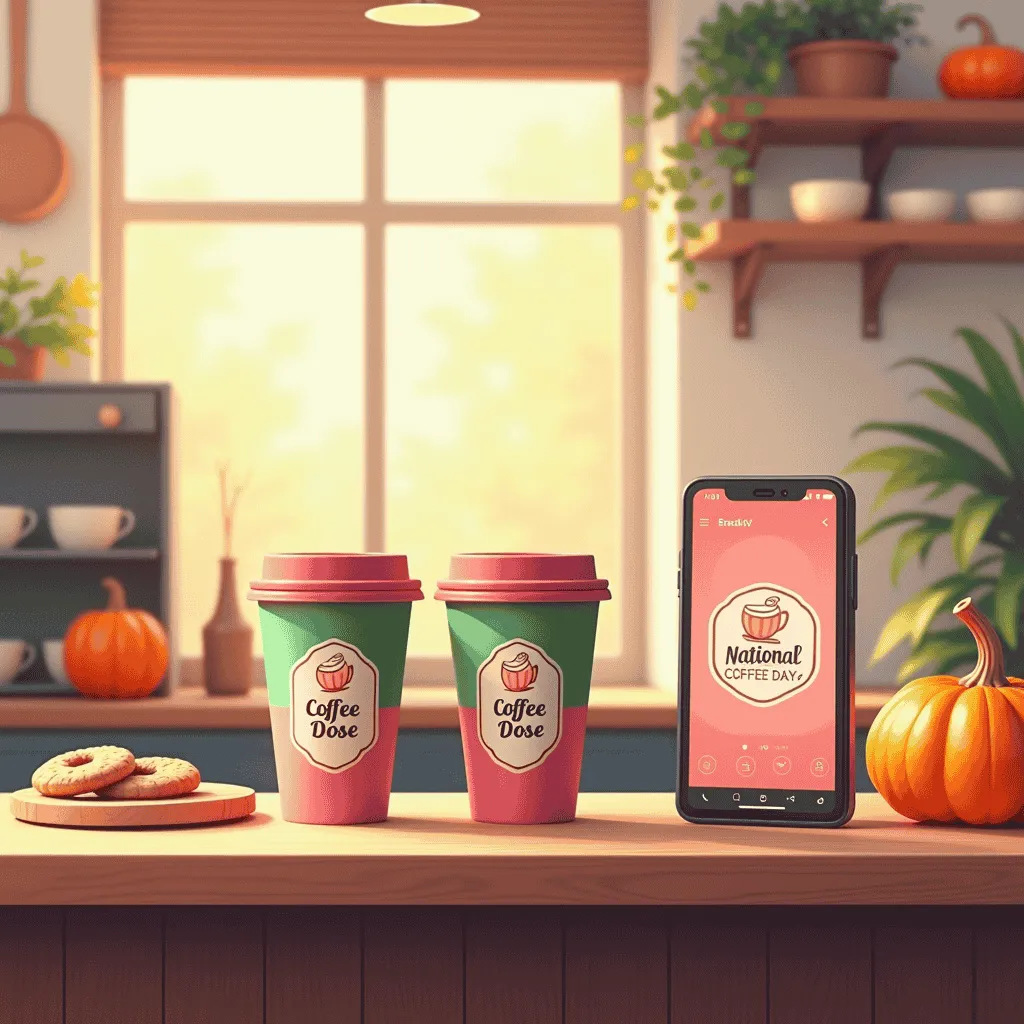
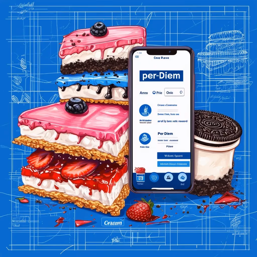
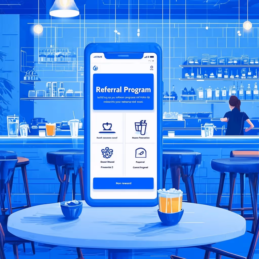
Per Diem Branded Apps
Brands powered by Per Diem, including Chip City, Tikka Shack, and Coffee Dose, show how smaller operators can compete with industry giants through thoughtful design. These apps connect in-store registers, web ordering, and mobile apps into one seamless loyalty experience. Customers instantly understand how to customize items because the affordances are clear. Options are tappable, modifiers appear in logical order, and defaults are pre-set to reduce errors. The apps also have fewer screens, the navigation is straightforward, and the layout is clean, which keeps the experience simple from start to finish. Feedback comes through real-time notifications and banners, keeping customers informed without effort. This consistency across touchpoints makes customers feel confident and cared for.
Lessons for Mobile App Development
From these examples, several lessons stand out for any team building or improving a mobile ordering app.
Keep Onboarding Simple
Asking for too much information upfront creates unnecessary friction. Long forms with fields like birthdays or secondary emails discourage new users. A streamlined sign-up with only essentials lowers drop-off rates and gets people to the menu faster.
Streamline the Flow
The entire order process should take no more than three or four clear steps: browse, customize, review, pay. Each screen should guide the user forward naturally, without making them backtrack or search.
Stick to Familiar Patterns
Users don’t want to learn a new navigation system just to buy a sandwich. Reuse common design patterns that customers are already familiar with from successful apps. This reduces cognitive load, making the process feel familiar and safe.
Test with Real Customers
Internal teams often miss friction points because they know the app too well. Testing with actual users reveals where hesitation occurs. Sometimes it’s a button placed too low on the screen, or a confirmation that disappears too quickly. These small details can make the difference between a smooth order and an abandoned one.
The Business Impact of Good Design
The difference between a confusing app and a seamless one is not just customer happiness; it’s measurable business growth. Starbucks attributes much of its sustained revenue to its app and loyalty program, which are designed with clarity and consistency. Sweetgreen has shared that its digital channels drive higher repeat rates than walk-in customers, proving that design affects retention.
A 2023 UX industry report found that every dollar invested in user experience can return up to $100 in revenue. For restaurants operating on thin margins, that return is significant. The right design reduces abandoned carts, increases order frequency, and turns first-time users into regulars. In a competitive market where customers have multiple dining choices, design is a strategic advantage.
Final Thoughts
Don Norman taught us that design is about communication, not decoration. A well-designed app guides customers smoothly, removing doubt at every step. A poorly designed one adds friction, uncertainty, and frustration. For mobile ordering, the stakes are clear: design choices directly influence sales, loyalty, and long-term growth.
The question every operator should ask is simple: Does your app feel like Empanada City or like Starbucks? Customers have already answered with their behavior.
Investing in thoughtful design is not an option. It is the modern equivalent of unlocking the front door, smiling at the customer, and taking their order without a hitch.
If you’d like to see how Per Diem helps cafes create that kind of seamless experience, sign up to explore the platform.

.svg)
.svg)
.png)

.png)
.png)


.avif)
.avif)
.avif)


.avif)


.avif)